

We pulled every active ad from 106 brands across DTC, ecommerce, and consumer categories. 67,852 ads in total. We classified each one by format and analyzed the mix.
Here are the data highlights:
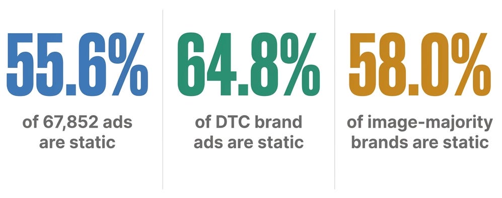
Brands like SHEIN (96.6%), Calvin Klein (93.4%), On Running (85.1%), Obvi (82.1%), and Fabletics (82.5%) are running heavily image-weighted accounts. These are not small brands hedging because they cannot afford video production. These are the largest Meta spenders in DTC.
This does not mean video is less important. Glossier runs 57% video. Honeylove runs 84% video. Both are successful. The point is that static is not a secondary format. If you haven’t cracked static ads or think they could perform better, that is why I’m writing this.
Quick note from Vinay. Curtis is about to hand you the system: 12 formats, 5 axes, one SKU turned into 20+ distinct ads. A healthy account runs 6 to 8 formats and ships 12 to 15 genuinely new statics a week.
Now look at your team and ask who’s actually producing that.
That’s the gap. The strategy above is right. The problem is a person cutting statics at 30 to 60 minutes each can’t hold 6 to 8 formats across 5 axes and still refresh weekly. So accounts quietly collapse back to 2 to 3 formats and one angle, and the algorithm reads it as sameness.
That’s what Notch fixes. Not a clip generator. An autonomous marketer that ships finished, Meta-ready ads across the formats Curtis just mapped. Paste a product URL → Product Hero, Social Proof, Before & After, UGC-Native, statics and video. Point it at a winner → it rebuilds the concept across new formats and personas, not 20 lazy iterations. Feed it your top ad → it branches genuinely distinct variations before fatigue.
Diversity, not just volume. The exact bar Curtis set.
And it pairs with a human, it doesn’t replace one. Your team directs and edits. Notch carries the production load they physically can’t.
This newsletter was brought to you by Notch, the autonomous marketer that ships winning ads. Built by ex-Meta folks behind Facebook Lead Ads and Instagram ads, raised $8M, now running creative for 4,000+ businesses. Readers get 30% off any annual plan → Sign up or book a custom onboarding call with founder Vinay.
Why the algorithm now rewards static diversity
Meta’s Andromeda update changed how creative gets evaluated and served. The algorithm now uses visual recognition to assess creative diversity across your account.
Real creative diversity now means genuine visual, format, and messaging variation. And static images are where you produce that diversity fastest and cheapest. PLUS those placements on Meta are cheaper on a CPM basis.
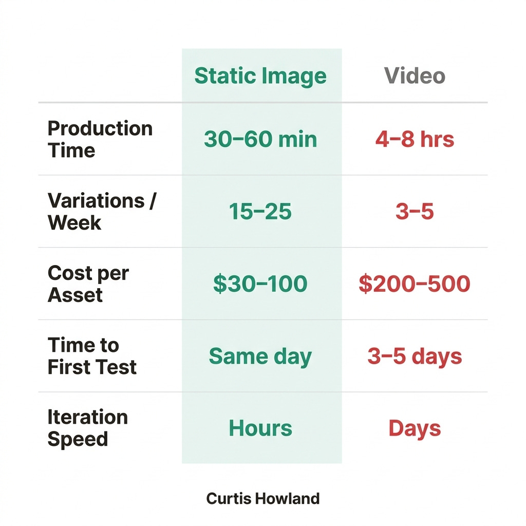
A static ad takes 30-60 minutes to produce. A video takes 4-8 hours. A small team can produce 15-25 static variations per week. The same team produces 3-5 videos.
AI changes this, but most people I talk to are still seeing better performance from strategically using AI to augment ad production, not to fully outsource it. End-to-end AI production creates volume. Proper AI usage should create efficient quality output.
Statics are cheaper to make, cheaper to place on Meta, and can test diverse angles quickly. Despite having less information density than videos, they still consistently perform in top DTC accounts.
The 12 static formats every DTC brand needs
Here is the system. Twelve distinct formats, mapped to the funnel stage where each does its best work. A healthy account has active ads in at least 6-8 of these at any given time.
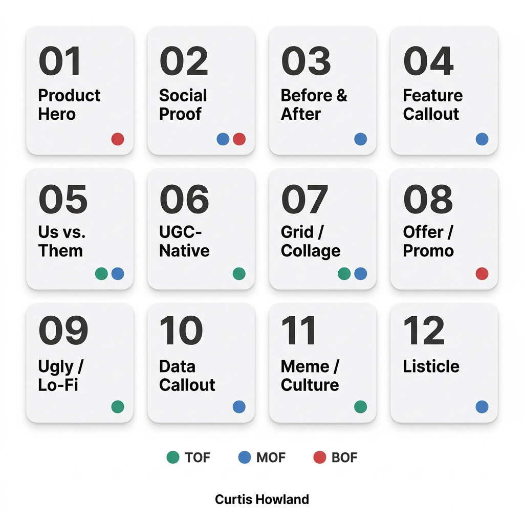
01. Product Hero (BOF)
Clean product photography on a neutral or branded background. The product is the entire message.
Works because it eliminates cognitive load for warm audiences. They already know what you sell. The fastest path to conversion is removing everything between them and the product.
Best for fashion, accessories, beauty, home goods. Especially effective on retargeting.
What to test: solid brand color background vs. lifestyle context vs. pure white.
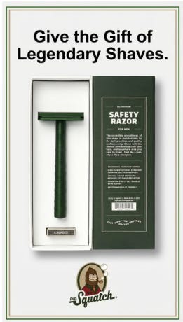
Dr. Squatch | High Impression Ad
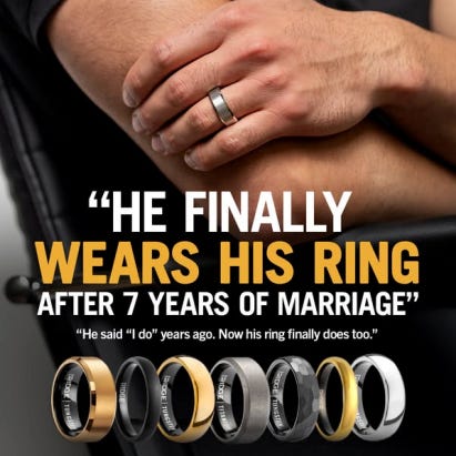
02. Social Proof / Testimonial (MOF, BOF)
Customer quotes, star ratings, review counts, expert endorsements paired with product imagery.
Works because when a prospect sees thousands of five-star reviews or a quote from someone who sounds like them, it short-circuits evaluation. The brain defaults to “if that many people trust it, I probably can too.”
Best for supplements, skincare, health, subscriptions. Anything with a trust gap.
What to test: customer review vs. expert endorsement vs. press mention.
Ridge Wallet | High Impression Ad
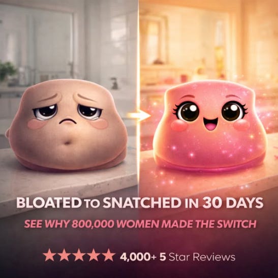
03. Before & After (MOF)
Split-frame visual showing the problem state versus the result after using the product.
Works because it makes the transformation tangible. The “before” triggers problem recognition. The “after” triggers aspiration. The product becomes the bridge.
Best for skincare, haircare, supplements, fitness, cleaning products. Obvi has built their entire static strategy around this.
What to test: horizontal split vs. vertical split vs. slider-style overlay.
Obvi | High Impression Ad
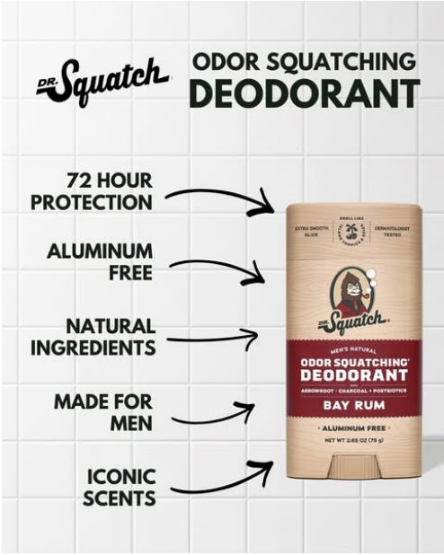
04. Feature Callout (MOF)
Product image with annotated benefit callouts pointing to specific features.
Works because annotation feels informational, not promotional. The viewer processes it like content. The arrows and callout boxes create a natural reading path.
Best for tech accessories, supplements with ingredient stories, apparel with functional features. Huel excels at this with clean ingredient breakdowns.
What to test: 3 callouts vs. 5 vs. full ingredient breakdown.
Dr. Squatch | High Impression Ad
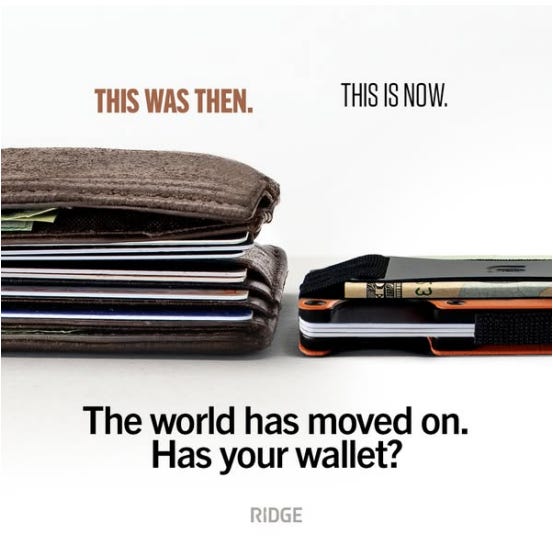
05. Us vs. Them / Comparison (TOF, MOF)
Side-by-side or chart-style comparison between your product and the competition, the old way, or the category default.
Works by anchoring your product against something the viewer already dislikes. They do not need to evaluate yours in isolation. They only need to agree that yours is better than what they are currently using.
Best for any product displacing an incumbent. Ridge built their brand on this format and has never stopped running it.
What to test: generic category (”old way”) vs. implied competitor vs. direct name.
Ridge Wallet | High Impression Ad
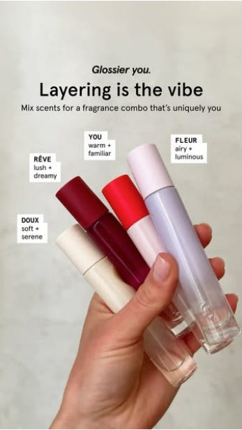
06. UGC-Native / Screenshot (TOF)
Designed to look like organic social content. Selfies, text message screenshots, comment replies, casual phone photos.
Works by bypassing the “ad filter.” After years of scrolling past polished brand creative, people have developed unconscious pattern recognition for ads. UGC-Native earns the half-second of extra attention that separates scroll from click.
Best for beauty, skincare, fashion, food. Glossier has mastered this.
What to test: selfie + text overlay vs. screenshot of texts vs. comment reply.
Glossier | High Impression Ad
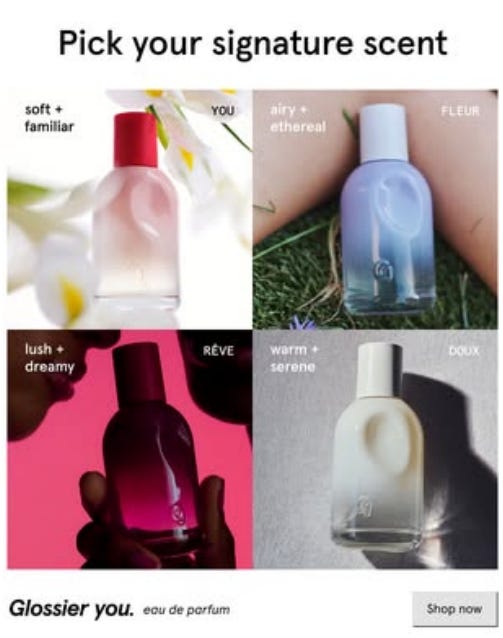
07. Grid / Collage / Mood Board (TOF, MOF)
Multiple images arranged in a grid. Pinterest-board energy combining product, lifestyle, UGC, and texture.
Works because grids trigger completeness. The brain wants to scan every cell, which increases dwell time. Each cell can target a different objection or desire.
Best for fashion, jewelry, home goods, beauty with diverse product lines.
What to test: all product vs. product + lifestyle vs. product + UGC.
Glossier | High Impression Ad
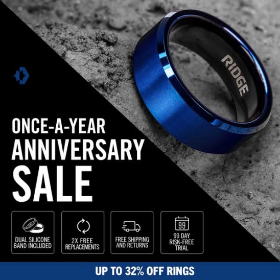
08. Offer / Promo (BOF)
Bold typography, discount codes, urgency language, clear CTAs. The conversion closer.
Works through loss aversion. “30% off ends tonight” triggers a fear of missing the deal that is often stronger than the desire for the product itself.
Best for any ecommerce brand running promotions. Especially powerful for the “Four Peaks” strategy of four major sales events per year.
Obvious: Black Friday / New Year / Memorial Day
Less Obvious: Spring Sale / Brand Birthday / Founder Birthday / BIS Sale / Cultural Event Sale
What to test: countdown urgency vs. scarcity vs. exclusivity.
Ridge Wallet | High Impression Ad
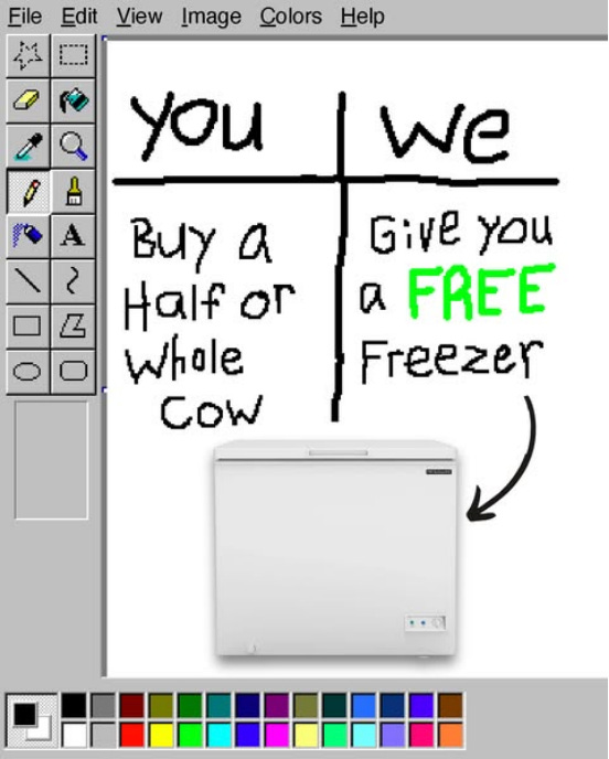
09. Ugly / Lo-Fi / MS Paint (TOF)
Deliberately unpolished creative. Handwritten text, crude drawings, mismatched fonts, screenshot energy. The anti-ad.
Works because it violates expectations. In a feed full of polished brand creative, something that looks like it was made in MS Paint creates genuine pattern interruption. The brain registers it as “not an ad.”
Best for brands with a strong established identity who can afford to break it. Also excellent for early-stage brands where authenticity matters more than polish.
What to test: MS Paint text vs. handwritten on paper vs. phone notes screenshot.
Dirty Dog Farm | High Impression Ad
10. Data / Stat Callout (MOF)
One powerful number or data point as the hero of the image. The statistic IS the creative.
Works because specificity feels more trustworthy than qualitative claims. “11,000+ five-star reviews” or “2 million wallets sold” creates instant credibility for the analytical buyer.
Best for supplements, review-heavy brands, subscriptions, products with clinical backing.
What to test: social proof number vs. product spec vs. outcome number.

Obvi | High Impression Ad
11. Meme / Culture (TOF)
Trending meme formats, pop culture references, humor-forward creative with brand messaging layered in.
Works because the brain processes it as entertainment first, advertising second. This earns not just attention but engagement: likes, comments, shares. Those social signals feed back into the algorithm and earn cheaper distribution.
Best for brands with humor-forward identity and a social team that moves fast. Dr. Squatch uses this consistently as a TOF entry point.
What to test: trending template vs. brand-specific recurring joke vs. reaction image.
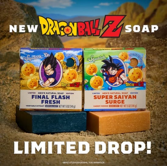
Dr. Squatch | High Impression Ad
12. Listicle / “Reasons Why” (MOF)
Text-heavy format listing 3-5 benefits, reasons, or ingredients. A mini landing page in a single image.
Works because lists are scannable. The numbered structure promises a specific amount of information and creates a completeness loop. Stacks multiple proof points into one impression.
Best for supplements, meal replacements, tech products, subscriptions. Huel uses this to stack nutritional benefits.
What to test: 3 reasons (cleaner) vs. 5 reasons (more comprehensive).
Huel | High Impression Ad
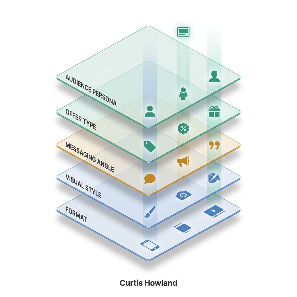
The 5-axis creative diversity framework
Format diversity is necessary but not sufficient. Genuine creative diversity on Meta lives across five axes. Some formats require some consistent overlap but this is my general framework:
Axis 1: Format. Which of the 12 you are running. Most brands default to 2-3. Top performers maintain 6-8 in rotation.
Axis 2: Visual style. Polished brand creative, lo-fi UGC, editorial photography. Running the same visual treatment across every format is still creative sameness.
Axis 3: Messaging angle. Pain point, aspiration, social proof, curiosity, humor, education. Each angle attracts a different segment.
Axis 4: Offer type. Free gift, percentage discount, dollar-off, BOGO, no offer. Dr. Squatch leads promos with free bags. Other brands never mention price. Test both.
Axis 5: Audience persona. Ridge runs the same wallet targeted at minimalists, travelers, tech workers, and gift-givers with completely different creative for each. Same product, different person in the ad, different context. One SKU becomes 20+ distinct ads.
The practical takeaway: if your account has format diversity but the same visual treatment, same angle, same persona across all of them, the algorithm still reads it as sameness.
Brand teardowns: five DTC accounts to study
Five DTC brands. How they build their static systems. What you can steal.
Dr. Squatch: The Volume Machine
Men’s personal care. Estimated $220-280M revenue. Acquired by Unilever in 2025.
Format mix: Heavy on Meme/Culture, Offer/Promo, and Ugly/Lo-Fi for TOF. Product Hero and Social Proof for conversion. Three-way split between humor-driven TOF, education-driven MOF, and urgency-driven BOF.
What to steal: Volume and iteration velocity. They test more creative than almost any brand in DTC and maintain a consistent brand voice that is humor-forward, masculine, and self-aware. They turn one celebrity partnership (Sydney Sweeney, Mike Tyson, Alan Ritchson) into dozens of format variations.
The opportunity if I were running it: They are extremely video-heavy. Scaling static production to match would open real headroom. Specifically more Data Callout formats built around their ingredient story, more Grid/Collage showing the expanding product line, and more UGC-Native since the audience skews young.
Ridge Wallet: The Premium Product Showcase
EDC accessories. ~$200M annual revenue, $300M+ cumulative wallet sales. Expanded from wallets into rings, backpacks, and luggage.
Format mix: Primarily Product Hero, Us vs. Them, and Feature Callout. Premium product photography on clean backgrounds. Side-by-side comparisons (slim Ridge vs. bulky traditional wallet). Material and color showcases. Offer/Promo around new product launches drives incremental ROAS above 4x.
What to steal: Making a simple product category feel premium and diverse. A wallet is a wallet, but Ridge sustains diversity through materials (aluminum, titanium, carbon fiber, Damascus steel), colors (20+ options), and use cases. Their comparison ads are best-in-class because no copy is needed to understand the value gap.
The opportunity if I were running it: They are very product-focused, which is their ceiling. More Social Proof formats built around the 2M+ wallets sold stat, UGC-Native showing real people using the wallet in context, and Listicle formats. The brand is strong enough to support Ugly/Lo-Fi as pattern interrupt.
Glossier: The Community-Driven Approach
Beauty and skincare. The brand that proved community-generated content could outperform traditional beauty advertising. 42.8% image in our dataset (one of the more video-leaning DTC brands).
Format mix: Centers on UGC-Native, Grid/Collage, and Social Proof. Unfiltered selfies, community mood boards, customer review statics that feel indistinguishable from organic Instagram posts. Product Hero exists but is secondary to people-first creative.
What to steal: Their visual identity is so consistent that even “unbranded” UGC immediately reads as Glossier. That is the mark of a brand system working correctly. They build campaigns around customer content, hitting social proof, diversity representation, and feed-native formatting all at once.
The opportunity if I were running it: They are heavy on TOF and MOF but lighter on BOF conversion creative. More direct Offer/Promo formats, Feature Callout ads explaining ingredient science (they have credibility to go deeper), and Comparison ads (natural approach vs. heavy makeup) would all earn a real test.
Obvi: The Bold Transformation Play
Collagen and weight management supplements. 82.1% image in our dataset. One of the most static-heavy supplement brands on Meta. One of the few openly using AI-generated imagery in static ads.
Format mix: Heavy on Before & After, Offer/Promo, and Data Callout. Bold, colorful, emotionally charged transformation ads. Social Proof statics with high-energy testimonials. Seasonal promos with strong urgency. Bright pinks, purples, bold typography.
What to steal: They have made Before & After their own by keeping it fun and aspirational rather than clinical or shame-based. The “before” is treated with empathy, not embarrassment. The “after” is framed as confidence, not just physical change. In a category where transformation messaging easily becomes problematic, this tonal choice is critical.
Huel: The Education-First Native
Nutritionally complete meal replacement. 67.8% image in our dataset. Highly systematized static creative.
Format mix: Feature Callout, Listicle, and UGC-Native are the core. Annotated ingredient breakdowns are some of the cleanest in DTC. A distinctive “reply to comment” UGC-Native format addresses common objections (”is it actually worth the money?”) in a native, authentic-feeling way.
What to steal: Education that feels native. The reply-to-comment format takes a real customer question and answers it in accessible, non-corporate language. Disarms skepticism by acknowledging the objection rather than pretending it does not exist. Feature Callout ads lead with outcomes (”complete nutrition in 2 minutes”) rather than specs.
The opportunity if I were running it: They play it safe visually. Everything is clean, branded, on-template. More Ugly/Lo-Fi, Meme/Culture (meal prep humor, “what I eat in a day” parodies), and bolder Before & After showing the convenience transformation (messy kitchen + 15 supplements vs. one Huel shake) would push them past their template ceiling.
The 5-minute account audit
Run these ten questions against your current ad account.
Are you running ads in at least 6 of the 12 static formats?
Do you have both polished and lo-fi visual styles active?
Are you testing at least 3 different messaging angles?
Do you have ads running with AND without a promotional offer?
Are you targeting at least 2 distinct audience personas with different creative?
Have you refreshed your oldest running static in the last 4 weeks?
Do you have at least one “ugly” or meme-format ad in rotation?
Is your static-to-video ratio at least 50/50 by ad count?
Are you launching 5+ genuinely new statics per week?
Can you name the top-performing format in your account right now?
Score yourself:
8-10 yes: Diversity is strong. Focus on iteration speed.
5-7 yes: Gaps exist. Use the format matrix to identify what is missing.
0-4 yes: Creative diversity is likely your biggest performance bottleneck.
The takeaway
Static images are 55.6% of all ads across the 106 brands we analyzed. Among DTC brands specifically, that number climbs to 64.8%.
There are some brands scaling successfully with 100% or 95% video. But if that’s you, it’s worth occasionally testing new statics to see if you can get one to hit.
The brands winning on Meta in 2026 are running both video and static 90%+ of the time. But the thing that lets them test fast, iterate daily, and maintain genuine creative diversity is a systematic static production process. Twelve formats. Five axes. Six to eight formats active at any time. Twelve to fifteen new statics per week.
When you find a winner, the job is not to crank out 20 more iterations of the same thing. It is to repurpose the winning messaging across genuinely new creative formats. A winning video hook becomes a static headline. A winning static becomes a carousel. A winning testimonial becomes a Data Callout.
Creative diversity beats creative volume. Every time.
Thanks again to Notch for sponsoring the newsletter. I met with them and was very impressed by their products. It's an autonomous marketer that ships winning ads. Built by ex-Meta folks behind Facebook Lead Ads and Instagram ads, raised $8M, now running creative for 4,000+ businesses. Readers get 30% off any annual plan → Sign up or book a custom onboarding call with founder Vinay.