

Two months ago I published what became my most-shared post: the 8 types of attribution every DTC brand should know. I called it the Christmas Tree Framework. It laid out the hierarchy of how attribution models fit together, from blended metrics at the top down to cohort LTV at the roots.
The #1 response I got was some version of: “Great framework. But how do I actually set this up?”
Fair. That post gave you the what and the why. This one gives you the how.
If you haven’t read the original, start there. It explains why the hierarchy matters. This post assumes you get the concept and you’re ready to build it.
Brought to you by Billo
I’ve been using Billo for 5 years across almost every client I manage creative for. One 9-figure brand, Billo's content is around 50% of total ad spend, besting four other agencies producing creative. We put $3M behind a single Billo creator in 6 months for them (quite profitably). The process is simple: order wide, test a lot, cut the bottom, and scale the winners hard. Then go back to those creators for new angles and concepts. Take those winning ads and test them with new creators. Let the creators speak authentically and test at least 10. If you’re like me, you will find some real gems. If you’re running paid media and not using Billo as your UGC pipeline, you’re overpaying for creative. Check them out here.
I’ve had a dozen companies reach out about sponsoring this newsletter, but I chose Billo as an exclusive partner. After 5 years of using their tool, and seeing all the recent improvements (analytics, AI mashes, auto scripting) I feel very comfortable recommending them as a high-value partner that you can test out today.
Back to attribution, here’s the quick version: think of attribution like a Christmas tree. The star at the top is your blended MER/nCAC. It tells you if the business is working. The upper branches are your channel allocation tools (post-purchase surveys, MMM). They tell you which channels deserve more budget. The lower branches are your ad-level tools (MTA, platform data). They tell you which ads to scale or cut. And the trunk (server-side tracking) holds all of it up.
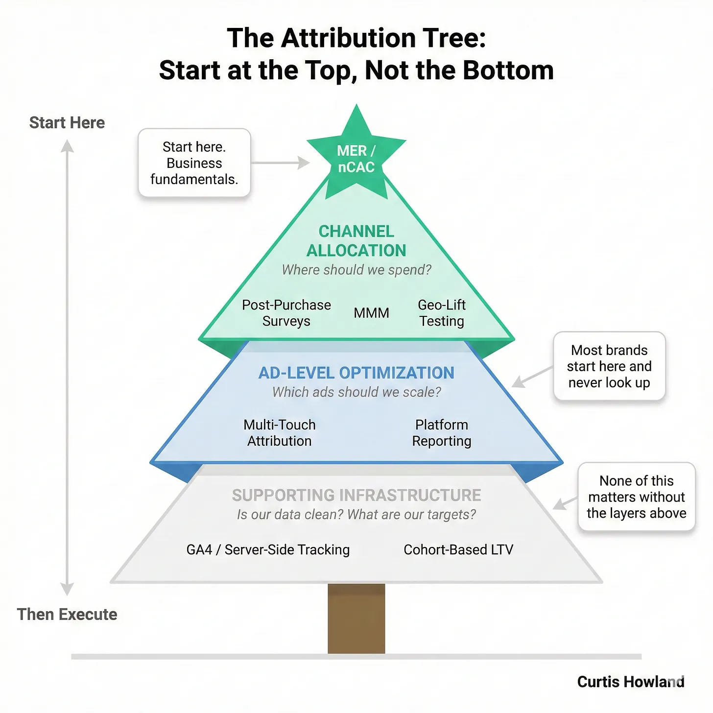
Most brands try to build this from the bottom up. They install an MTA tool and try to track every click before they even know their blended numbers. That’s backwards. You build top-down.
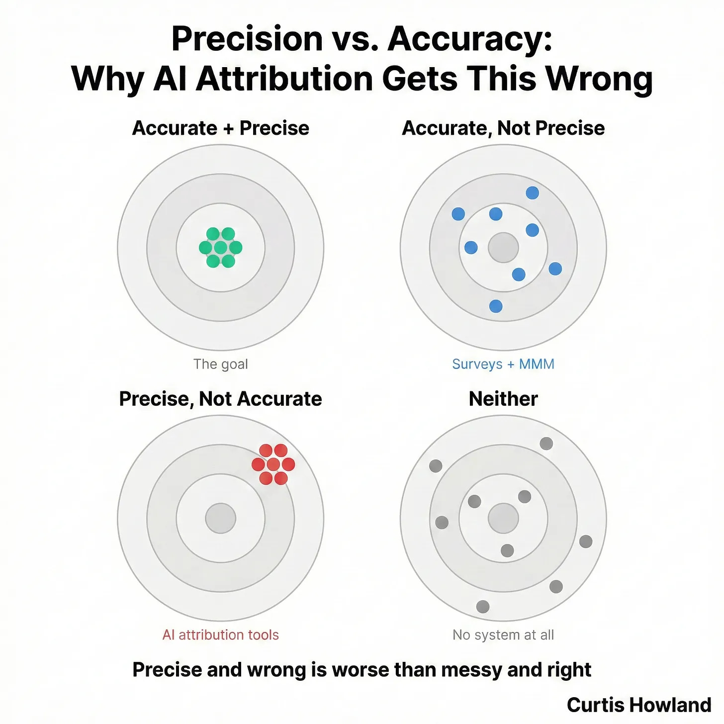
Its also important to note that we are aiming for accuracy AND precision, in order to do so you need to get the steps down in the right order. Skipping to MTA gives your precision (tempting) but not accuracy (dangerous)
Here’s how. Step by step.
Step 1: Build Your MER/nCAC Tracker (15 Minutes in Google Sheets)
This is the star on the tree. It takes 15 minutes to build and it’s the most important thing in your entire attribution stack.
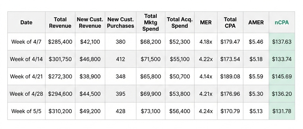
Open a new Google Sheet. Here are your columns:
Column A: Date (Daily or weekly rows)
Column B: Total Revenue
Column C: New Customer Revenue
Column D: Total Purchases
Column E: New Customer Purchases
Column F: Total Marketing Spend
Column G: Total Acquisition Spend (paid media only)
Then your calculated columns:
Column H: MER (Marketing Efficiency Ratio)
=B2/F2Total Revenue divided by Total Marketing Spend. This is your top-line efficiency number. Channel-agnostic. If MER is healthy, the business is profitable (or burning appropriately). If it’s not, nothing else matters.
Column I: Total CPO (Cost Per Order)
=F2/D2Total Marketing Spend divided by Total Orders. This is your cost per order across all customers, new and returning. Because repeat buyers are in the denominator, this number should always be lower than your nCPA. Returning customers should cost you (almost) nothing to re-acquire, so they bring the average down.
This is useful as a broad health check, but it can hide problems. If your Total CPA looks great but your nCPA is ugly, your repeat customers are masking the fact that new customer acquisition is too expensive. You’re riding your existing base, not growing it.
Column J: AMER (Acquisition MER)
=B2/G2Total Revenue divided by Acquisition Spend only. This isolates your paid media efficiency from retention spend.
Column K: nCPA (New Customer CPA)
=G2/E2Acquisition Spend divided by New Customer Purchases. This is the number I watch most closely. (nROAS if AOV is changing a lot) It tells you what you’re actually paying per new customer on your paid channels, without retention costs or repeat buyers muddying the picture.
The gap between Total CPA and nCPA is one of the most revealing numbers in DTC. A small gap means most of your orders are new customers (either early-stage brand or your retention is weak). A large gap means repeat buyers are carrying the business, which is great for margins but means your nCPA target needs to be realistic about what acquisition actually costs.
Where the numbers come from:
Total Revenue, New Customer Revenue, Total Orders, and New Customer Purchases all come from Shopify (or whatever your ecommerce platform is). Filter by first-time vs. returning to split orders and purchases. Marketing Spend is your total across all channels, including email/SMS tools, influencer payments, everything. Acquisition Spend is just your paid media aimed at new customers (Meta, Google, TikTok, potentially influencers, etc.). It depends company to company but if it heavily impacts new customer growth and is not employee cost, include it.
How often to update:
Weekly minimum. Daily if you’re actively scaling or testing new channels. We track daily and occasionally intra-day pacing on large spends even at these high level numbers.
The two numbers that set your guardrails:
Your maximum marketing spend = Gross Margin % minus OpEx %. Cross this line and you’re losing money at the company level. This is the ceiling.
Your target CPA = projected 3-month customer profitability. This is your efficient growth zone. It’s the number where you’re acquiring customers who will be profitable within a reasonable timeframe.
Everything else in this post is about figuring out how to spend between those two numbers as effectively as possible.
Quick example of why this matters first: A client comes to me with a “4.2x ROAS” on Meta. Looks great. But when I pull their MER tracker, their nCPA is $120 on a product with $85 in 3-month projected profit. They’re underwater on every new customer.
The Meta dashboard was telling a story that the business math didn’t support. Once we identified it the solution was clear, fix the broken exclusions, change the creative strategy, and install a system to optimize for new customers on their higher AOV product.
That’s why you start here. Every time.
Step 2: Set Up Your Post-Purchase Survey (30 Minutes with Fairing)
This is the most underrated tool in DTC attribution. (Yes a majority use it, still underrated) It lives on the upper branches of the tree. It tells you where to allocate budget at the channel level.
The tool: I use Fairing. It exports to Google Sheets automatically with their built in tool, the setup is simple, and the data is reliable. KnoCommerce also works well. I’ve seen people custom build them too. I’m sure there are other good ones but I always recommend Fairing to start out since it’s never failed us and is inexpensive. Really though, any tool that lets you ask a post-purchase question and export the data works.
The exact question:
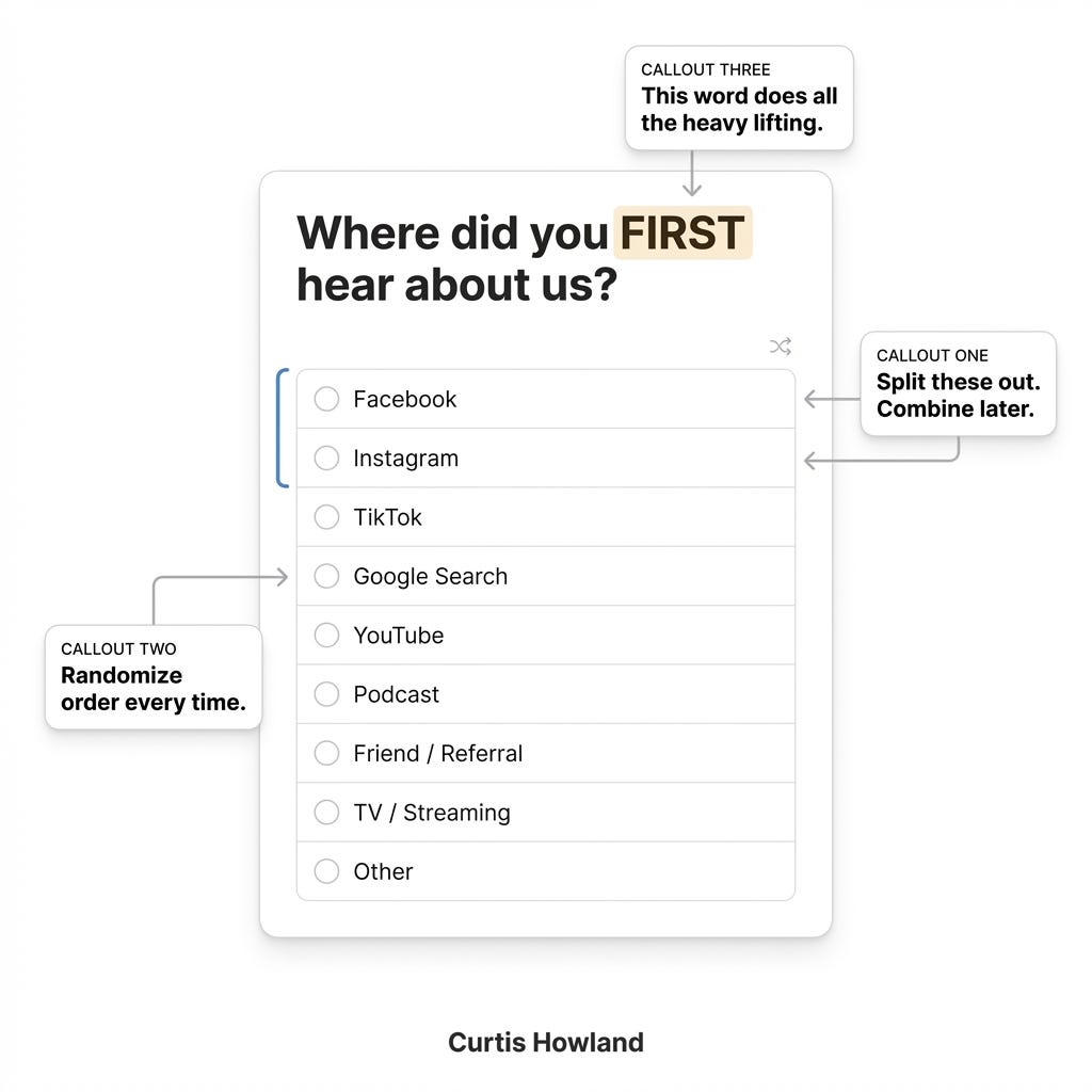
“Where did you FIRST hear about us?”
FIRST in all caps. This matters. You’re not asking where they last clicked. You’re asking what created the awareness. That distinction is the whole point.
The answer options (randomize the order every time):
Facebook
Instagram
TikTok
Google Search
YouTube
Podcast
Friend / Referral
TV / Streaming
Other (with text field)
A few things to note here. Split Facebook and Instagram into separate options. Yes, they’re both Meta. You’ll combine them later in your analysis. But splitting them in the survey catches signal you’d miss. A lot of people know the difference between where they saw your ad, and that data is useful for creative strategy even if you combine it for budget decisions.
Keep total options under 10. Randomize the display order so you don’t bias toward whatever’s listed first. And always include “Other” with a text field. You’ll find stuff in there you didn’t expect. If you have any primary channels not listed here, swap them in.
Target response rate: 35%+. If you’re below that, make the survey more prominent in your checkout flow or simplify the question. Some brands get 50%+ with good placement.
Note, there are lots of good secondary questions you can ask. Follow ups to the first (more detail or specificity). Timing (how long since you first heard about us). Ideation (What is your favorite selling point). Etc. Normally about 50% of people answer each successive question (40%, 20%, 10%, 5%) so at scale you still get a lot of data 4 or 5 questions deep.
The output that actually drives decisions:
Export your survey data daily/weekly. The math here is simple but the extrapolation is what makes it powerful.
First, calculate your response rate. Take total new customer survey responses and divide by total new customers for the period.
=Total New Customer Responses / Total New CustomersIf you got 133 survey responses out of 380 new customers, your response rate is 35%. That’s your multiplier for everything below.
Second, sum responses by channel. In your export, count how many new customers selected each channel (Facebook + Instagram, TikTok, Google, etc.) for the period.
Third, extrapolate to all new customers. This is the key step most people skip. Not everyone answers the survey, but the ones who do are a representative sample at 35%. Divide each channel’s response count by your response rate to get the implied total new customers from that channel.
=Channel Responses / Response RateIf 47 people said “Facebook” and your response rate is 35%, that implies ~134 total new customers actually came from Facebook that week. Not 47. The survey only captures a slice, and you need to account for the full picture.
Fourth, calculate cost per implied new customer by channel.
=Channel Spend / Implied New CustomersNow you have an estimated true CPA by channel based on where customers say they actually discovered you, extrapolated to your full customer base. That’s a fundamentally different (and often more useful) number than what the ad platforms report.
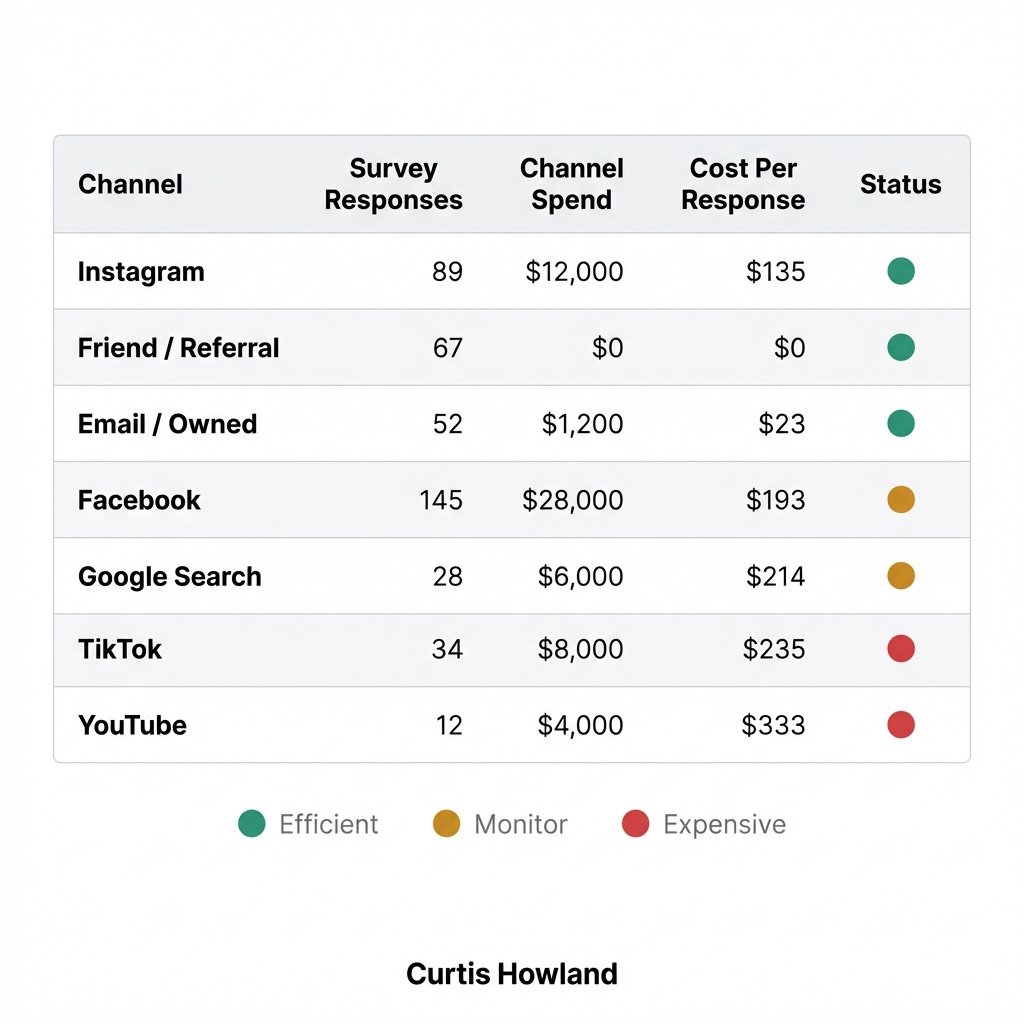
If Meta is showing you a $40 CPA but your survey-implied CPA for Facebook + Instagram combined is $90, there’s a gap. That gap is usually view-through attribution inflation. The survey is catching the signal that click-based tools miss.
The key here is that you are evaluating based on impact (what people remember) and first impact (where they first heard about you) on an attribution model that is MECE (mutually exclusive and completely exhaustive) instead of potentially overlapping and overcounting or undercounting customers (which then means you can trust it for financial analysis and target setting.
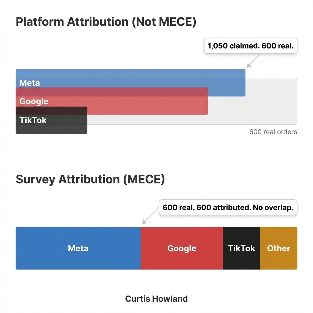
Use this number to set your channel level budgets, how much you spend on Meta vs Google vs Tiktok.
ONLY then move onto allocating across campaigns/ads and using an MTA for intra channel analysis.
Limitation to remember: People don’t always remember correctly. Long purchase cycles make this harder. That’s fine. You’re using this for directional channel allocation, not surgical precision. The directional signal is extremely reliable still.
Step 3: Configure Your MTA Tool (Triple Whale)
Now we’re on the lower branches. This is where you make ad-level decisions: which ads to scale, which to cut, which to retest.
The tool: I use Triple Whale as my primary MTA. Northbeam is also one we use internally. The main reason I prefer TW: it gives live data that updates regularly and you don’t have to pay extra for the refresh rate. Paying extra for up to data data makes me upset but otherwise North beam is great too.
The setup that matters:
Start with Total Attribution as your default view (non MECE but we already solved for that in the first step). This gives you the full picture across all touchpoints. Then toggle between attribution models (first-click, last-click, linear) to pressure-test what you’re seeing.
Why don’t we just use an MTA for channel level allocation and skip the post purchase survey?
Facebook is much better at pushing people to click the link than TikTok, Google grabs a ton of last clicks. TV? No clicks at all! (Google will grab them though I promise).
A 3x Google ROAS =/= a 3x TikTok ROAS in an MTA.
But once we are within a channel it gets a bit cleaner (still exceptions though).
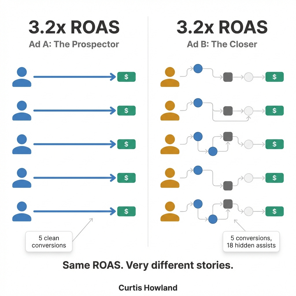
When you see a new ad performing well, don’t just look at the ROAS number. Click into the actual conversions. Look at the customer paths.
If you had 5 customers who all clicked the ad directly as their first interaction, that’s a strong signal. The ad is doing real work finding new people.
If you had 5 customers who all saw 3-4 other ads before eventually clicking this one, that’s a different story. The ad might be getting credit for conversions that were already in motion. It’s a closer, not a prospector. Still valuable but know the difference.
That distinction changes your scaling decision entirely. A prospecting ad that’s working deserves more budget. A closing ad that’s riding other ads’ coattails might require warm audiences to scale which means you need to be a bit slower in the scaling.
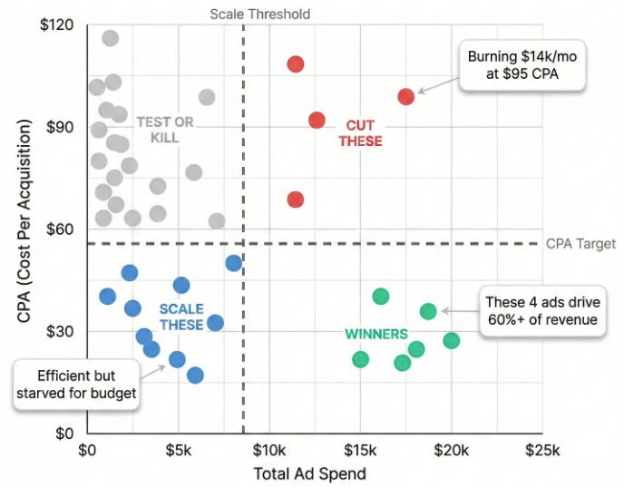
The Account Control Chart:
This is the visual I use to manage every ad account. Pull your MTA data and plot CPA (y-axis) vs. Total Spend (x-axis) for every active ad on a scatter plot.
You get four quadrants:
Low CPA, High Spend (Bottom right): Your winners. These are doing exactly what you want. Protect them.
Low CPA, Low Spend (bottom left): Efficient but under-scaled. Push more budget here. This is where the opportunity lives.
High CPA, High Spend (top right): Burning cash. Cut or restructure immediately.
High CPA, Low Spend (top left): Not working but also not hurting you much. Kill them and reallocate.
If your best ads aren’t in the low CPA / high spend zone, you have a media buying problem that no amount of new creative will fix.
Step 4: Wire It Together
You’ve got your three tools built. Here’s how they work together in practice.
Every day, in this order:
First: Open the MER tracker. Is the business healthy? Are we between our max ceiling and our target CPA? If nCPA is trending up, I need to understand why before I do anything else. If it’s stable or improving, I move on.
Second: Pull the survey data. Any shifts in where new customers say they’re discovering us? If Instagram’s share of responses is climbing while TikTok’s is dropping, that’s a signal about where demand is actually being created, regardless of what the ad platforms claim.
Third: Open Triple Whale. Which ads are winning? Do the winners align with what the surveys are telling me about channels? Scale what’s working. Cut what’s not.
When the tools disagree (this is where it gets interesting):
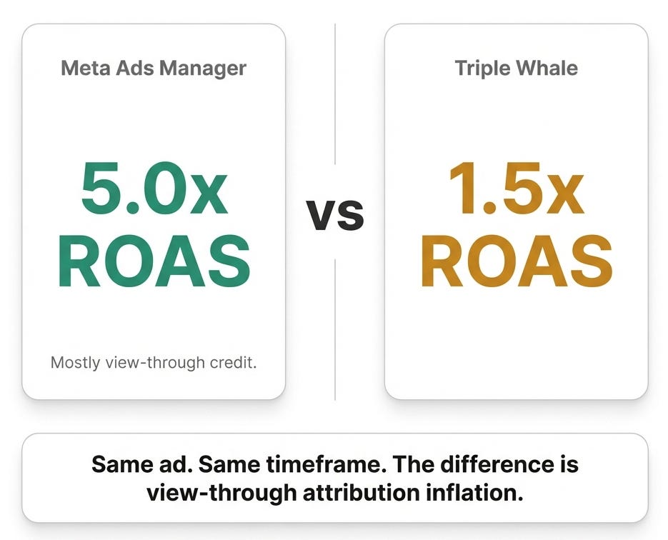
Real example, anonymized. A client had an ad on Meta showing a 5x ROAS in Facebook’s dashboard. Looked like a home run. But when we checked Triple Whale, the same ad was showing a 1.5x.
We dug in. The ad was promoting a specific product that simply didn’t have enough sales volume to justify what Facebook was reporting. When we looked at the attribution breakdown, the vast majority of Facebook’s claimed conversions were view-through credit. Meaning someone was “served” the ad (possibly for one second while scrolling), didn’t click, and then bought something later. Facebook took credit.
This is something Meta’s system does constantly. It’s not a bug, it’s how their attribution works. But it means their dashboard will consistently overstate performance on certain ads, especially broad-targeted ones with high impression volume.
We trusted Triple Whale, pulled budget from that ad, and reallocated to ads that were showing strong performance in both systems. Overall account efficiency improved.
The principle: You’re not looking for three tools to agree perfectly. They won’t. You’re looking for the disagreements, because that’s where the insight lives. Thats where you get to learn interesting things about your customers.
Step 5: The Upgrade Path (Build for Your Spend Level)
Not every brand needs every tool on day one. Here’s what to build first based on where you are.
$10K-$50K/month:
Build the MER tracker and set up Fairing and use interface data for optimization. That’s it. These two tools will give you 80% of the insight you need at this spend level. Skip MTA for now, the cost isn’t justified and your volume might not be high enough for the data to be meaningful.
Setup time: 1 hour.
$50K-$250K/month:
Add Triple Whale or Northbeam. Make sure server-side tracking (CAPI or Elevar) is set up and firing correctly on Shopify. Without server-side tracking, every other tool in your stack is working with incomplete data.
Setup time: About 1 week to get clean data flowing.
$250K+/month:
Layer in cohort LTV by acquisition channel. Start adjusting your CPA targets by channel based on customer quality, not just acquisition cost. Consider MMM (Meta’s Robyn if you have data science resources, or a SaaS platform like Measured or Sellforte if you don’t). Run your first geo-lift test (Haus makes this accessible, northbeam has this now too) on your biggest spend channel.
Setup time: 1-2 months for meaningful data.
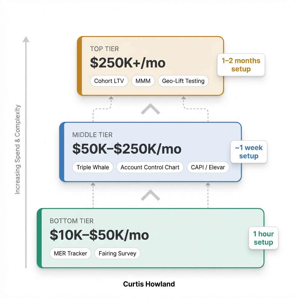
The point is: start at the top of the tree. Get your blended numbers right. Layer in survey data. Then add precision tools as your spend justifies them. Most brands try to build this in reverse and end up with precise data pointing in the wrong direction.
The Takeaway
Attribution isn’t a dashboard you install. It’s a system you build, one layer at a time, starting from the top.
Your MER tracker takes 15 minutes and it’s the most important thing in the stack. Your post-purchase survey takes 30 minutes and it’ll change how you think about channel allocation. Your MTA tool takes a week to configure and it’ll change how you manage ads.
Wire them together. Check them weekly. Dig into the disagreements more than the agreements.
And never let a platform grade its own homework.
If you want the full framework behind all of this (the 8 models, how they fit together, and why the hierarchy matters), read the original post here.
If this was useful, send it to your team!