

Monday’s email covered when to launch and what to offer. This one is what the ads looked like.
I pulled 68,245 Black Friday ads from last year out of the Meta Ad Library for this analysis (all analyzed by hand…. the hand of AI…)
Okay so what were the ads?
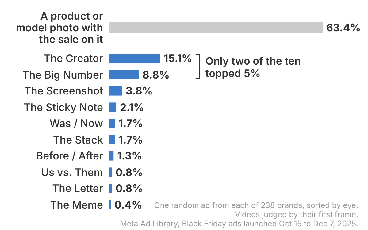
Most of them are either products, creators, or a big number.
My recommendation is that you try to build some of each, and here’s the breakdown.
Lead with the price
The deal is the first thing you see. These were 12% of brands’ ads, most of them The Big Number.
Big brands put the price in the picture three times as often as small ones: 26% of their ads, against 8.5%.
In short: don’t get cute with ads, show the number.
1. The Big Number
The discount is the whole ad. Every Black Friday ad says “sale,” and the number is the only part that changes, so it goes first.
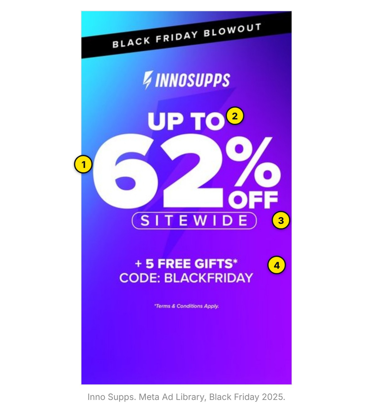
The number is the widest thing in the frame.
“Up to” sits small on top. Clear but not the main thing.
The scope sits right under it: sitewide.
One sweetener plus the code: 5 free gifts, BLACKFRIDAY.
Make it: Set the number bigger than your logo and your product.
Skip if: Your real number is small, or “up to” does all the work.
50% off was the default last year. That’s the number to beat, if your margin can take it.
2. Was / Now
“40% off” makes people do math. “$80, now $48” makes it easy - good for a key product.
Make it: Put both prices in one glance and strike the old one through.
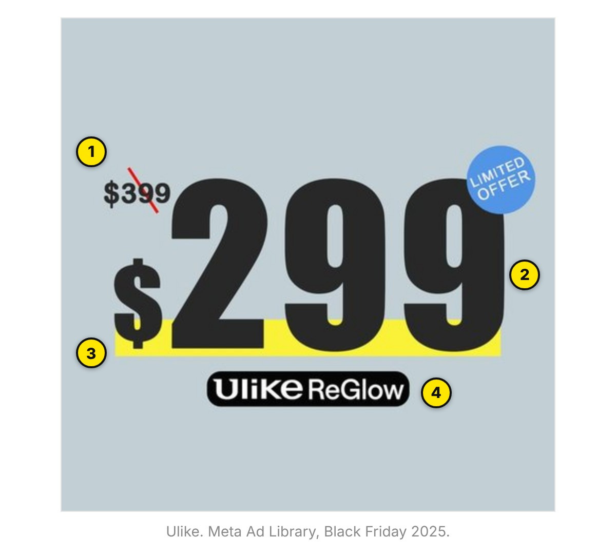
The old price: small, slashed in red.
The new price, about six times taller.
A yellow highlighter bar under it.
No product photo. The price is the picture.
Skip if: The “was” price is one you never charged. The FTC doesn’t like that.
3. The Stack
The offer, itemized: discount plus gifts plus shipping, each one shown. Seeing the gift makes the value concrete.
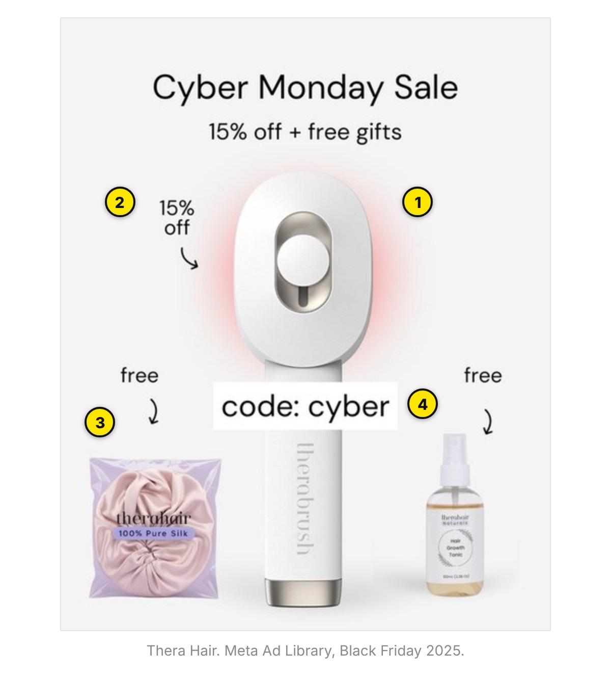
The hero product, dead center.
The discount is just one more arrow: 15% off.
Each gift gets its own “free” and an arrow pointing at it.
The code sits on the product: “cyber.”
Shoot the free items beside the product and label each one. Skip it if the gifts are filler. A pile of junk cheapens the hero.
Lead with proof
The deal is still there. It just isn’t the first thing you see.
These were 17% of brands’ ads, and almost all of that was The Creator (15%, every one a video). Us vs. Them and Before / After were each under 2%.
4. Us vs. Them
Your product beside the alternative, with the difference spelled out. It answers “why this one” in the same frame as the deal.
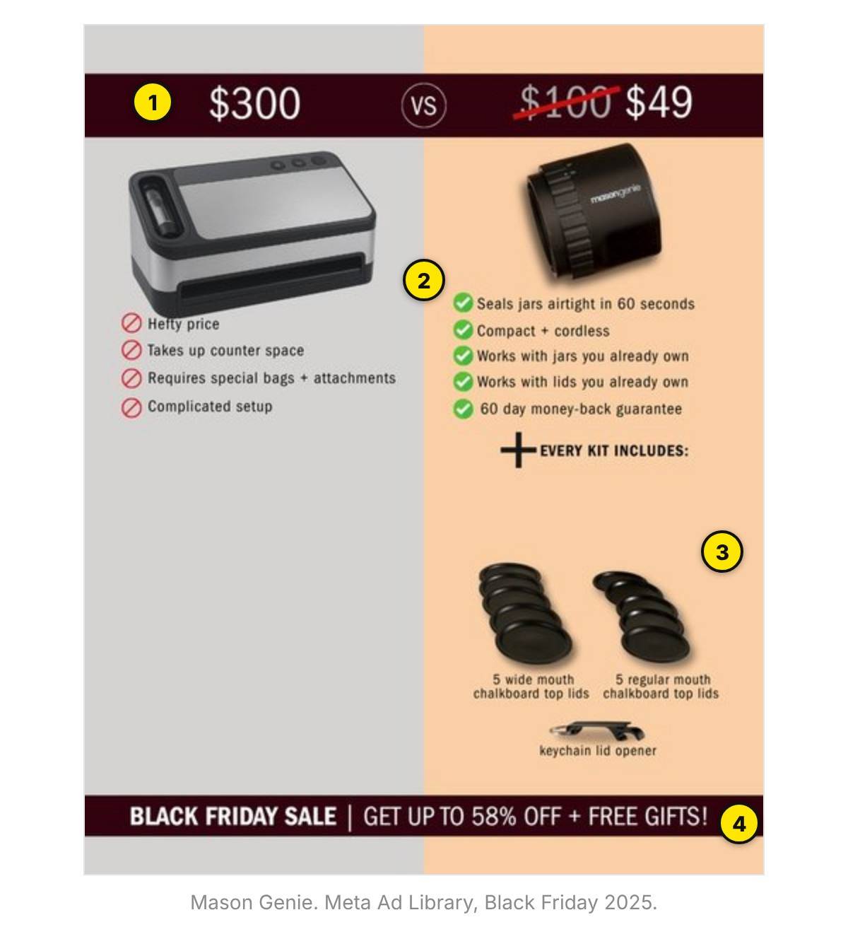
The anchor: a $300 sealer vs. a $49 kit, with $100 struck.
Grey for them, warm for us: four problems, five checks.
“Every kit includes,” pictured: lids and an opener.
The sale sits in a band at the bottom, away from the proof.
Make it: Compare against what your buyer actually weighs you against.
Skip if: You can’t back up what you’d be saying about the competitor.
5. Before / After
The problem and the result, side by side. The proof lands before a word is read; the sale gives the reason to buy now.
Check this one before you shoot. Skip it if it’s weight loss or a health claim. Meta will kick these back.
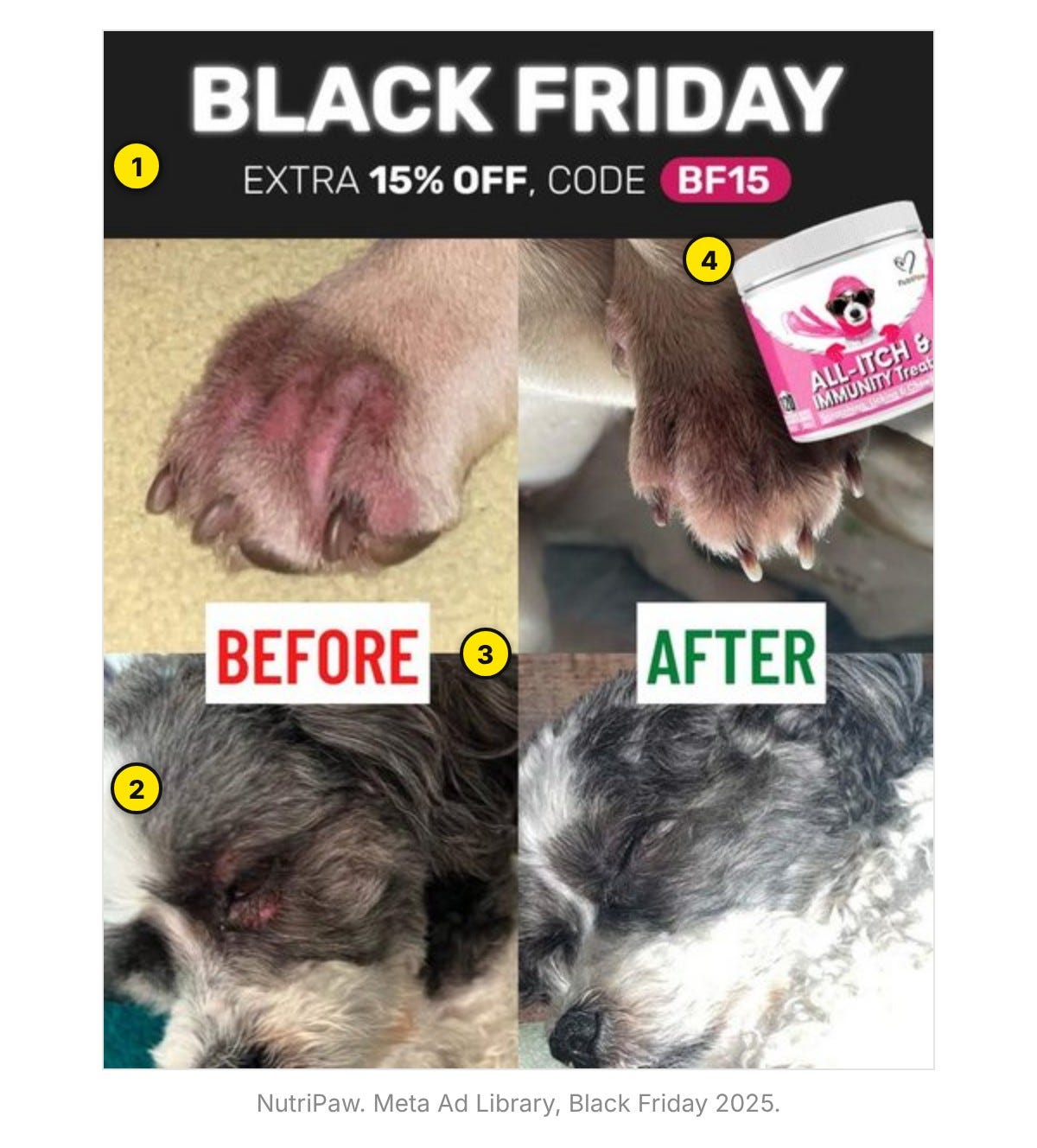
The offer gets its own band: extra 15% off, code BF15.
Two before/afters, shot on a phone: paws and eyes.
Red BEFORE, green AFTER. Color does the labeling.
The product sits in a corner. The dog is the hero.
Make it: Same angle, same light, both halves labeled big.
6. The Creator
A person on camera, mid-sentence, captioned. A half-finished line makes people wait for the next one.
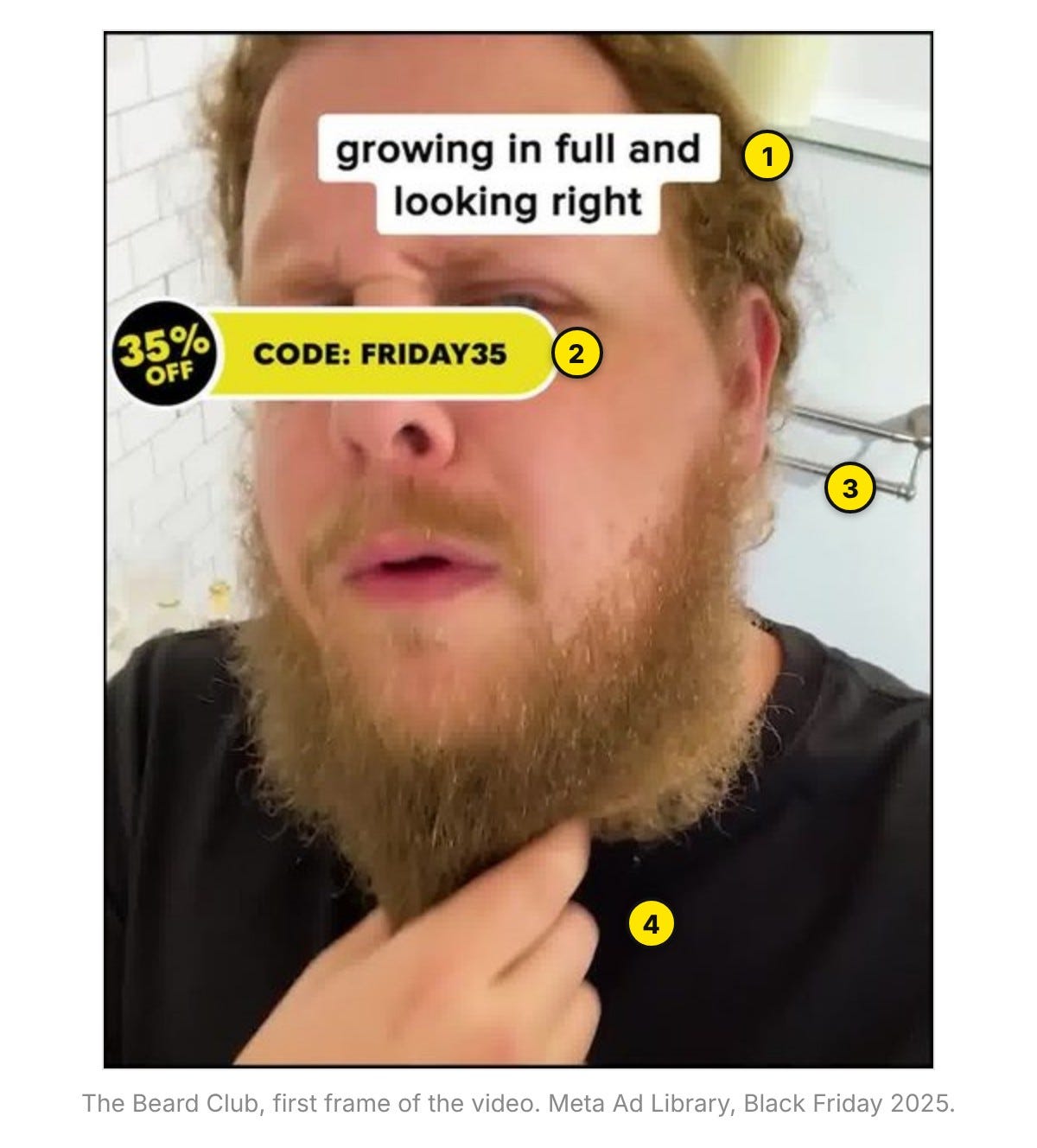
The caption starts mid-sentence: “growing in full and looking right.”
The offer as a sticker, code included: 35% off, FRIDAY35.
Shot on a phone in a bathroom. No studio.
The result is the product shot: the beard.
Make it: Open on the face and a half-thought; put the code on screen after.
Skip if: You can’t find someone who looks like a real customer.
The Beard Club ran another Creator ad from Oct 16, 2025 to this October: 369 days, tied for the longest run in the whole set.
Don’t look like an ad
These read as something else first: a receipt, a letter, a note, a meme. Together they were 7% of brands’ ads.
7. The Screenshot
The ad dressed as something people trust: a text, a tweet, a receipt, a cart. Those read as information, so the offer gets read too.
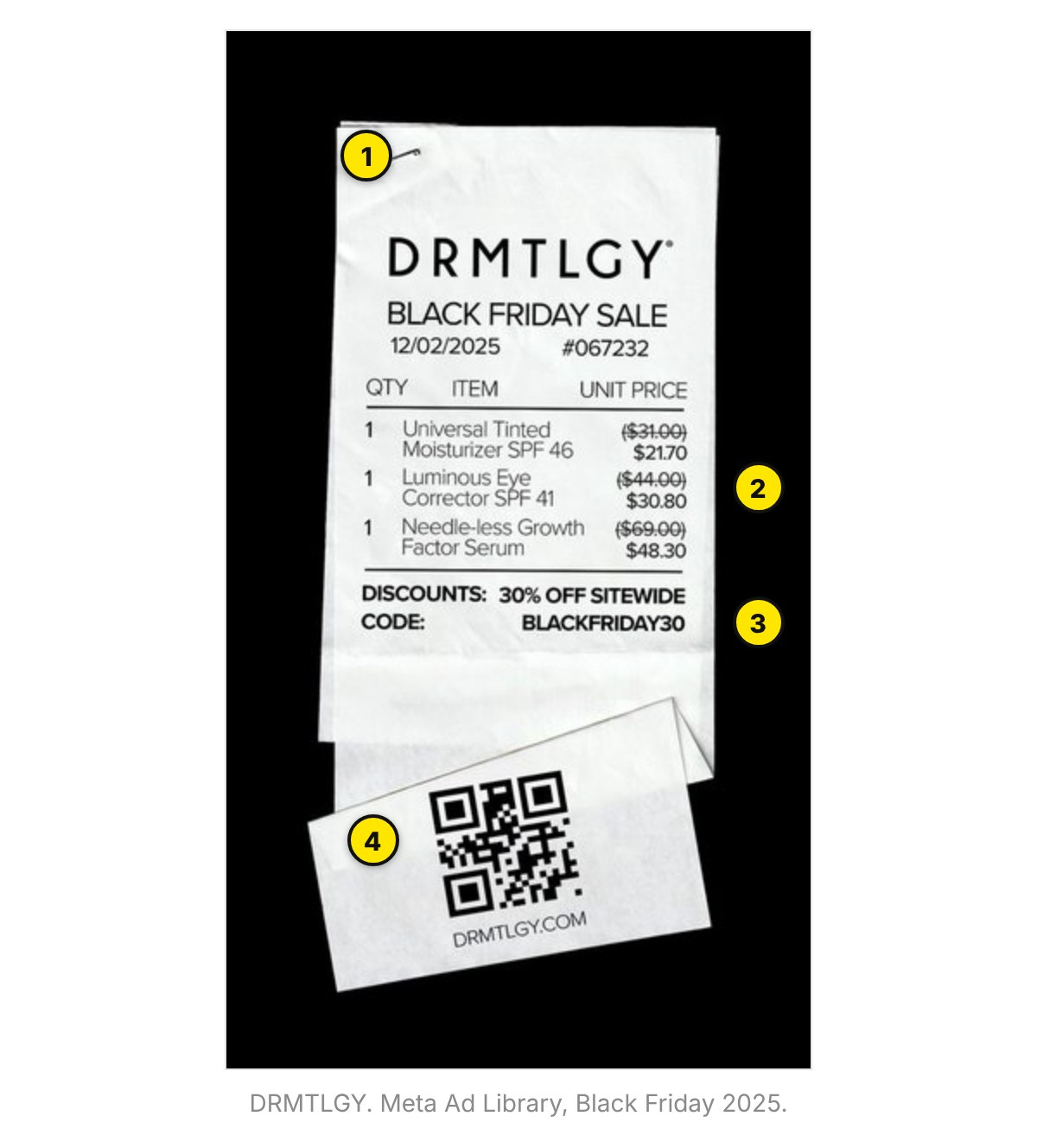
Real receipt details: a date, a number, even a staple.
Three real products, each with its old price struck.
Discount and code sit where a receipt puts them: the bottom.
I don’t love that this one has a QR code and a link. I’d rather have a “Click the link” CTA so Meta can see the conversion clearly.
Make it: Use a format your buyer sees daily, and get every detail right.
Skip if: You’d have to invent the words. The FTC bans fake reviews.
8. The Letter
A wall of text: an apology, a thank-you, a note from the founder. In a week of shouting, a quiet block of text reads like news.
NOBL’s starts as an apology and ends as the offer:
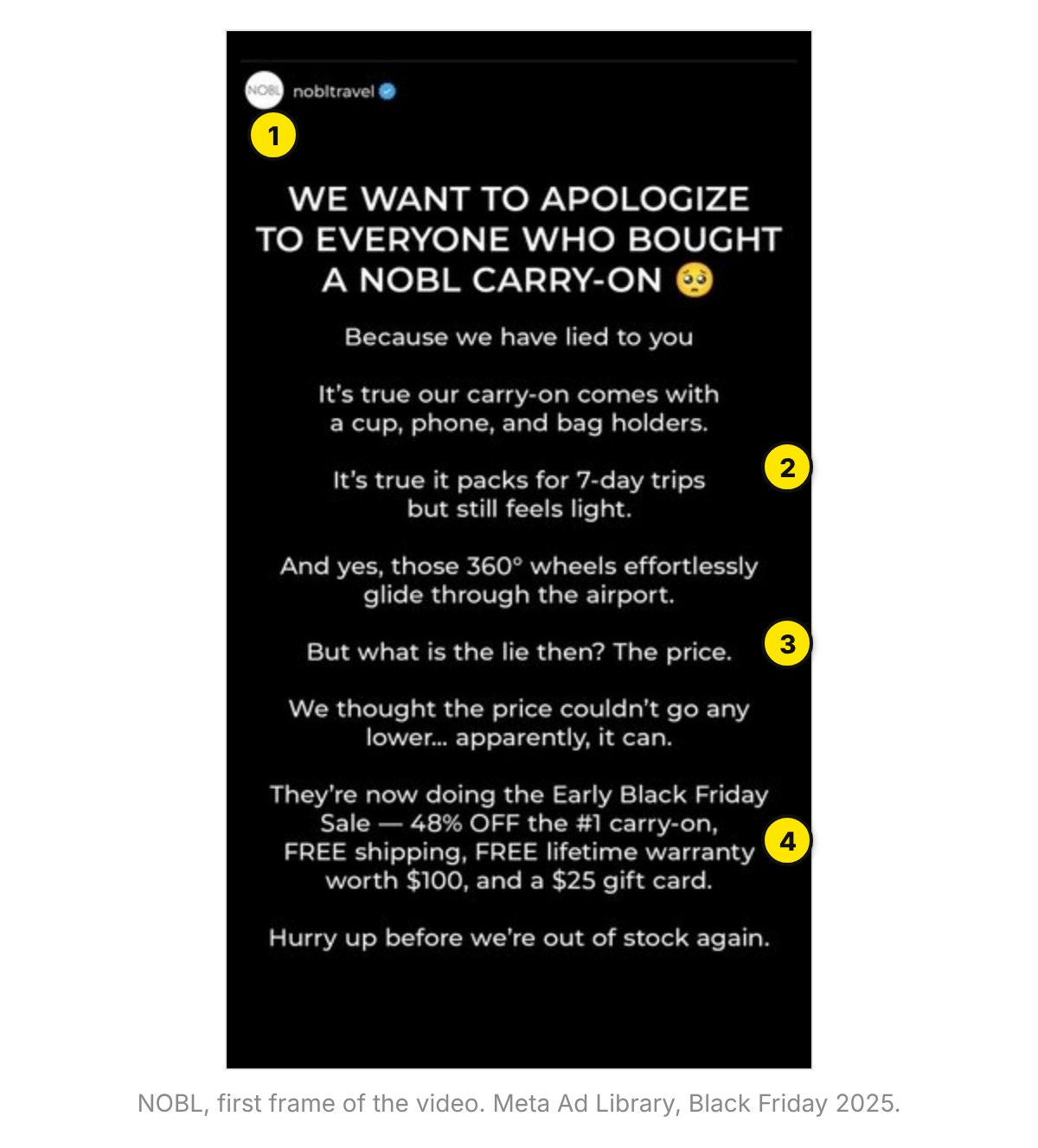
An apology for a headline: “We want to apologize…”
The “lies” are the features: cup holders, 360° wheels.
The twist: “But what is the lie then? The price.”
The offer waits for the last third: 48% off and a gift card.
Make it: Open like news, give the real reason for the deal, then sign it.
Skip if: The story is made up. Readers can tell.
NOBL’s was still running at the Oct 21 pull, 330 days after it launched.
9. The Sticky Note
A handwritten note on the product, the counter or the laptop. It looks like a person made it, and handwriting takes longer to read.
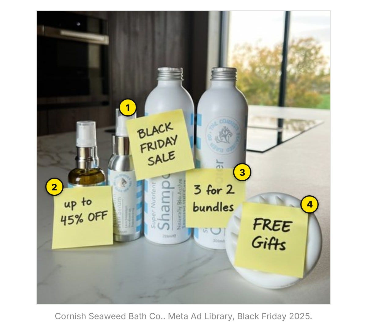
The event: “Black Friday Sale.”
The discount: “up to 45% off.”
The bundle: “3 for 2.”
The extra: “FREE Gifts.” One note, one message.
Make it: Real product, real counter, a pad and a marker. That’s the shoot.
Skip if: Your brand sells on polish and scrappy would undercut it.
10. The Meme
A meme format people already know, with the sale dropped in. The joke is already understood, so the ad reads in a second.
It was also one of the rarest: 1 of the 238 random ads.
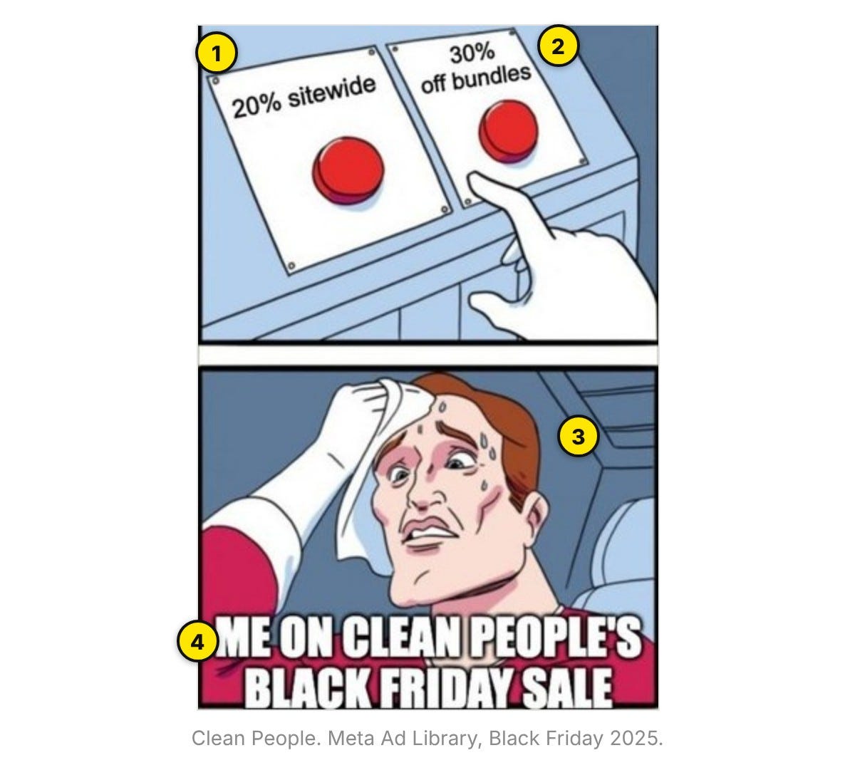
Button one is a sale: 20% sitewide.
Button two is another sale: 30% off bundles.
The sweating guy is the shopper. Either button is a purchase.
The brand is in the punchline, so every share carries it.
Make it: Use a format your buyers already share; make the deal the punchline.
Skip if: The format is stale, or the face is a celebrity’s.
Try them all!
At least eight of the ten kinds had an ad still running on Oct 20, 2026, 327 to 369 days after it launched.
Brands that make proof ads run all their ads longer. Ads tagged as testimonials, UGC, comparisons or before/afters had a brand median of 16 days, against 10 for all ads. Inside the 627 brands that ran proof ads alongside other ads, the two had the same median: 16 days.
What to make this week
Pick by what you already have:
A big, real discount → The Big Number, or Was / Now if you’ve charged the old price
Gifts worth showing → The Stack
Proof you can back up → Us vs. Them, Before / After or The Creator
No time for a shoot → The Screenshot, The Letter or The Meme
Your product, a sticky pad and a phone → The Sticky Note
Then get them live. Early access by Nov 10, sale ads by Nov 14.
The full field study is live here: Get it free
Data: Meta Ad Library, 68,245 ads from 6,281 brands that named Black Friday or Cyber Monday, launched Oct 15 to Dec 7, 2025. Median run lengths use EU-delivered ads, because the Library cuts US run dates short.
Happy Sale driving!
Curtis
The "Skip if" lines are the most useful part of this. Most swipe files only show what worked and leave out when it backfires, like a "was" price you never charged or a before/after Meta will reject. The pick-by-what-you-have list at the end is going straight to our team. The Sticky Note is so cheap to make there's no excuse not to test it this week.
Leading with the price rather than getting cute is the part most brands still resist. Black Friday is one of the few weeks when the buyer is already shopping for a number, so hiding it is rather a strange choice. The stack of discount plus gifts plus shipping also reminds me of old mail-order ads that itemised every reason to reply. Clarity beats cleverness when the calendar is doing half the selling.